
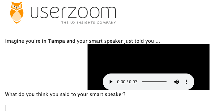
Testing Content at Scale
We faced a major challenge with The Weather Channel for voice: how do we conduct robust experiments to smart speaker content at scale? With internal and external partners, I led the establishment of a testing practice that enabled me to learn what work and what didn’t and to quickly refine content
Method, not Madness
In partnership with UserZoom and TWC research, I was part of an industry first effort to test smart speaker content at scale.
UserZoom provided the technology and worked with research on the methodology, ultimately borrowing from the CPG vertical to use a JAR or “just about right” scale. In this methodology, the user is presented with a scale to tell us whether the response has too little, too much, or is just about right. Foe these tests, success is >65% replying with a ‘3’.
For my part, I identified all of the required tests and sorted them into epics. I wrote copy variations and recorded the necessary files for use in the surveys. To maintain the required pace, I ran surveys and documented and interpreted results. Ultimately, our response consistently beat our nearest competitors, the default Alexa weather skill and the Big Sky skill. I also drove optimizations on presentation of all data elements and insight types to ensure TWC met user needs and wants at launch.
Besting ourselves
The Weather Channel had long ago developed 12 and 24-hour daypart narratives for use on TV. These were early, early examples where texted was converted to audio. For us, the existing daypart narratives gave us variants against which we could test the custom weather narrative we’d build for our skill. Tests were run to vary location, weather condition, and presence of a severe weather alert.
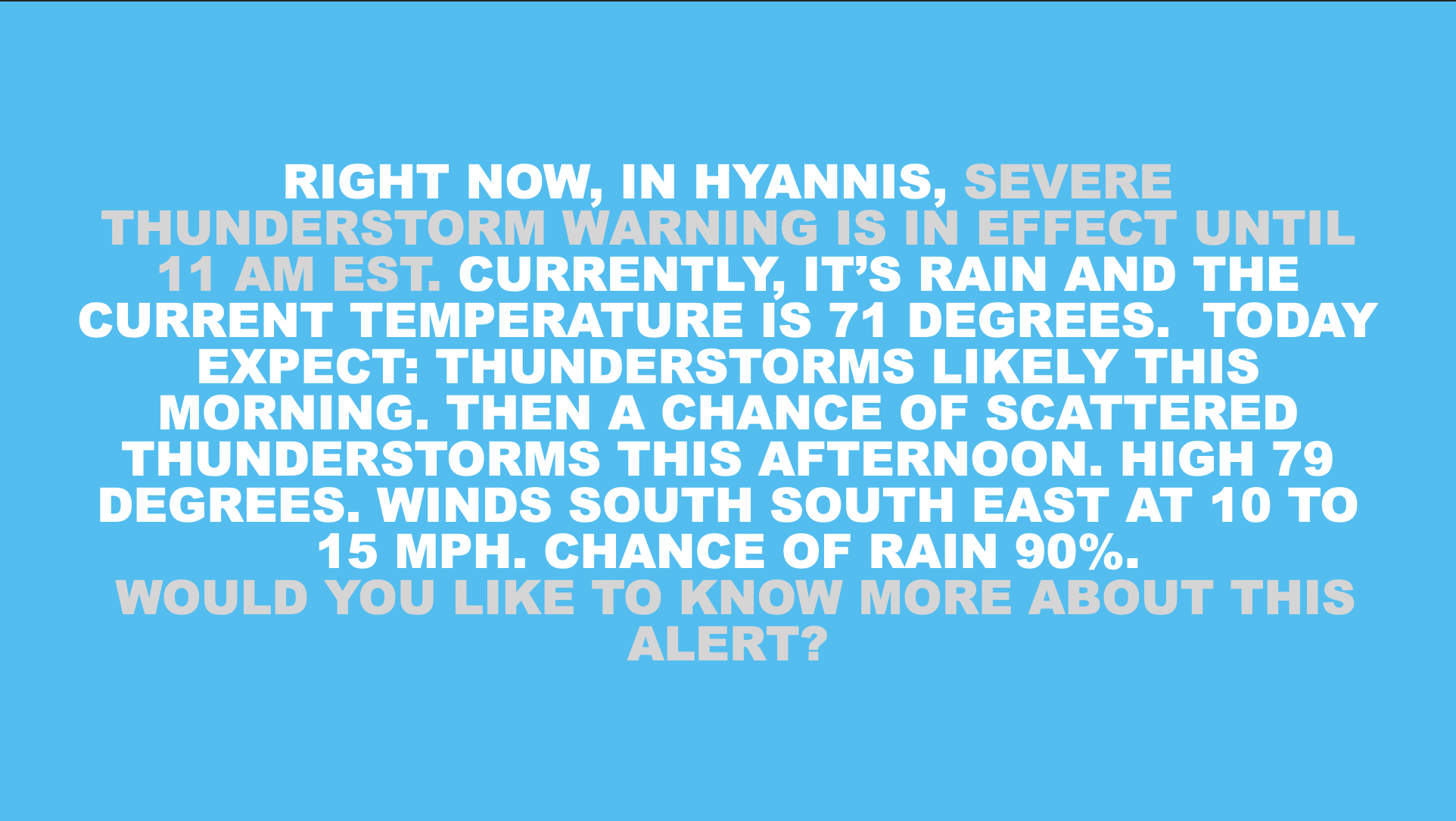
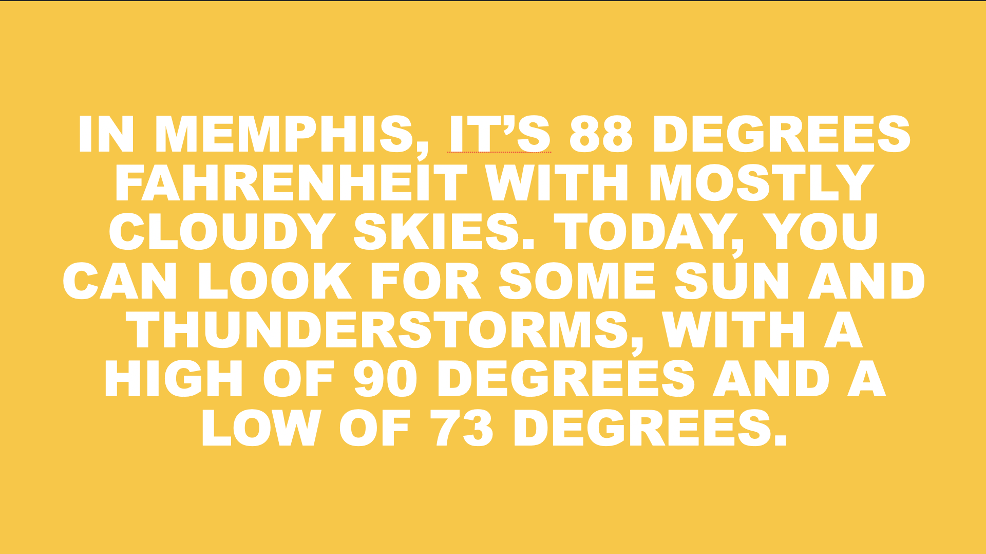
24-hr daypart 🥉
At a 24 hour view, the forecast models are less certain than a 12-hour view or an observation, or point-in-time snapshot, of the weather. While users liked that it was short, it lacked in detail in comparison to the other two. So, testing this version helped set a benchmark on message length and guide trade-off decisions in deciding what information to share.
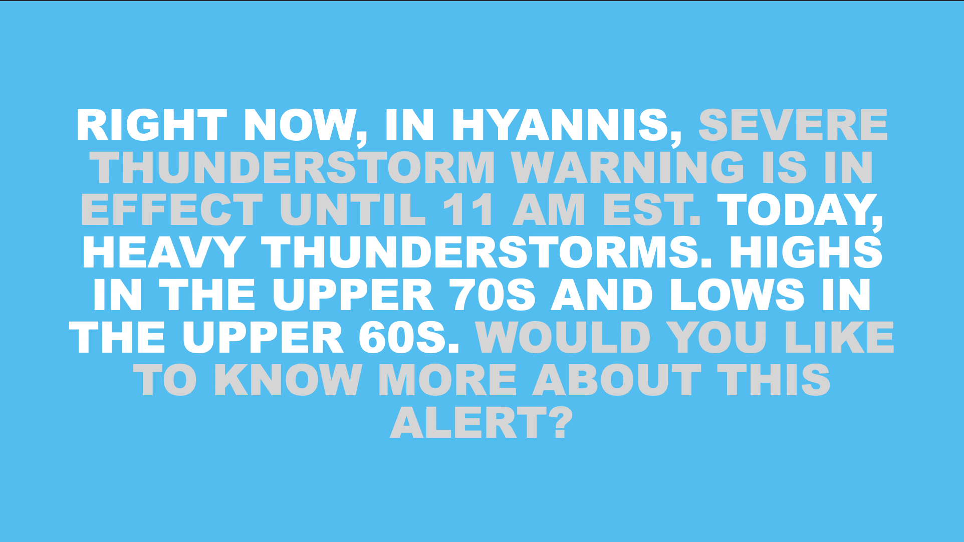
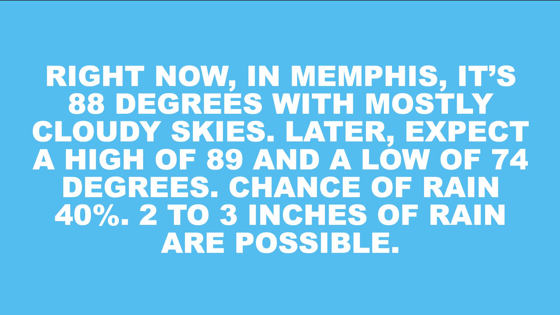
12-hr daypart 🥈
We used this preexisting ‘voice ready’ narrative when we began development. I liked it as a conservative starting point, because it had a lot of information for a user who might be trying to use the app to plan their day. In testing, it scored poorly. it had too many data points to process, it gave users too much to remember, and it was just too long.
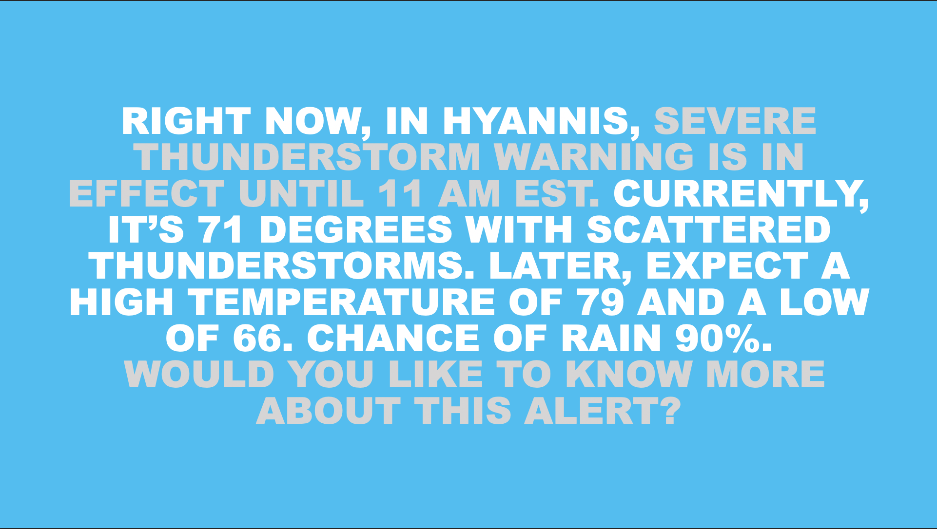
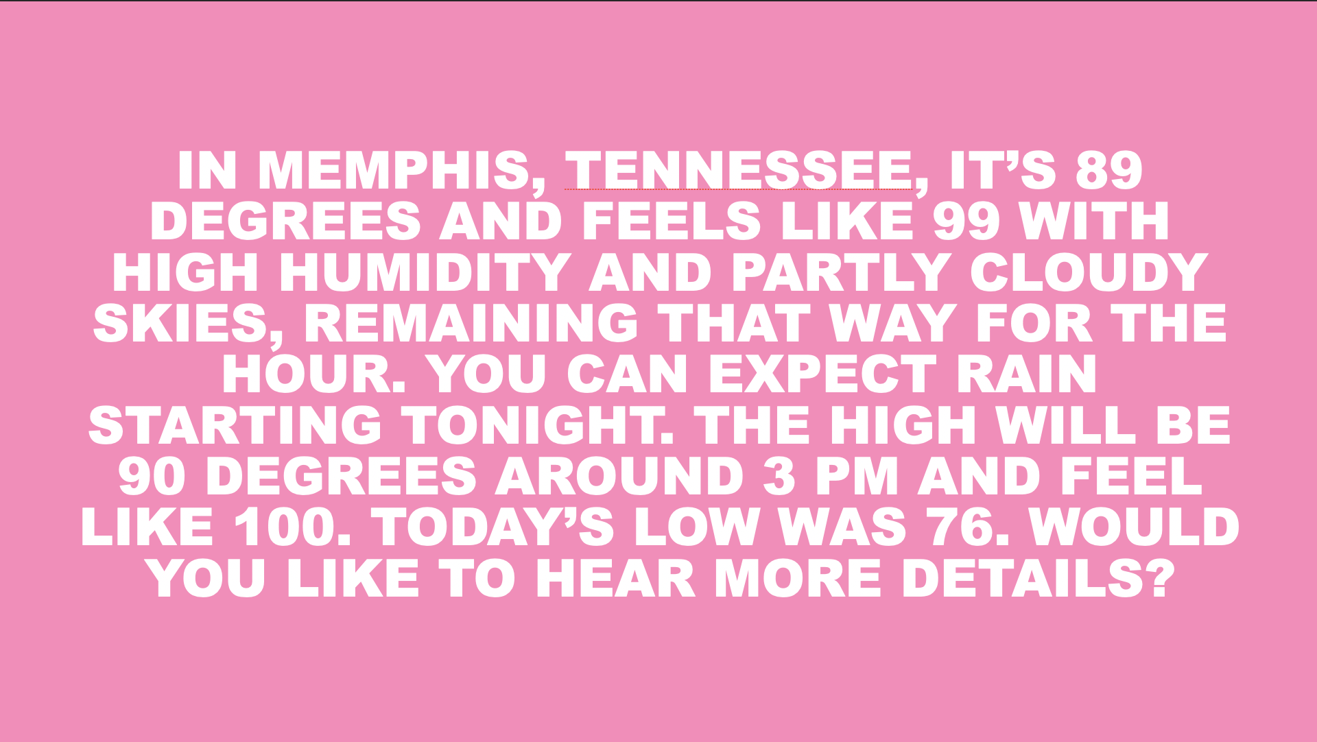
Custom 🥇
The most effective piece may be the shortest version of itself. This version comes in a second or so longer than the 24-hour narrative. But, I chose to always include chance of rain, since it’s important for someone who is deciding what to wear or whether to bring an umbrella. As the winner, this moved on for testing head-to-head against competitors.
Besting the competition.
Once we had a winner from our internal testing, it was time to compare ourselves to the competition. We compare our winning weather narrative to the default Alexa weather skill and The Big Sky skill. Tests were run to vary location, weather condition, and presence of severe weather alert,
Weather Channel🥇
I have to say, I was nervous to put my work out against the big dogs. But, I’m very happy that we won in a blind test. I think what works here is the editing. The careful selection of only the most essential data points, and it considers the time, place, and context in which the user is looking for weather. So, we have just what someone would need to get out of the door in the morning.
Alexa 🥈
Weather is top-three use case for smart speakers. With Amazon’s lead in smart speaker penetration, this is the most accessed weather app in the space. If we had to beat anyone, it’s Alexa. Interestingly, they have right to use Weather Channel data. But, it lost a little due to information density and having multiple conditions that make the story less clear than it could be.
Big Sky 🥉
Big Sky is an often promoted skill by the Alexa Developer community. It was an early entrant, has good reviews, and 20-30M MAUs. It’s often presented as a success story in Alexa skill development. But, in a blind test, it was the clear loser. With multiple data points to process and compare / contrast and it’s run time, test participants found it more confusing than helpful.
Fine tuning the details
No data values 🥈
Technically, it was a tie between this, the incumbent, version and the option with a turn. But, users took issue with the quality of the message content and the message about sunscreen. As one user, Carlos, said: “A smart speaker shouldn’t sound like my mom!” While not a universal complaint, since this message tied for first, it was enough for me to rethink these kind of ‘gear’ or ‘self-care’ messages.
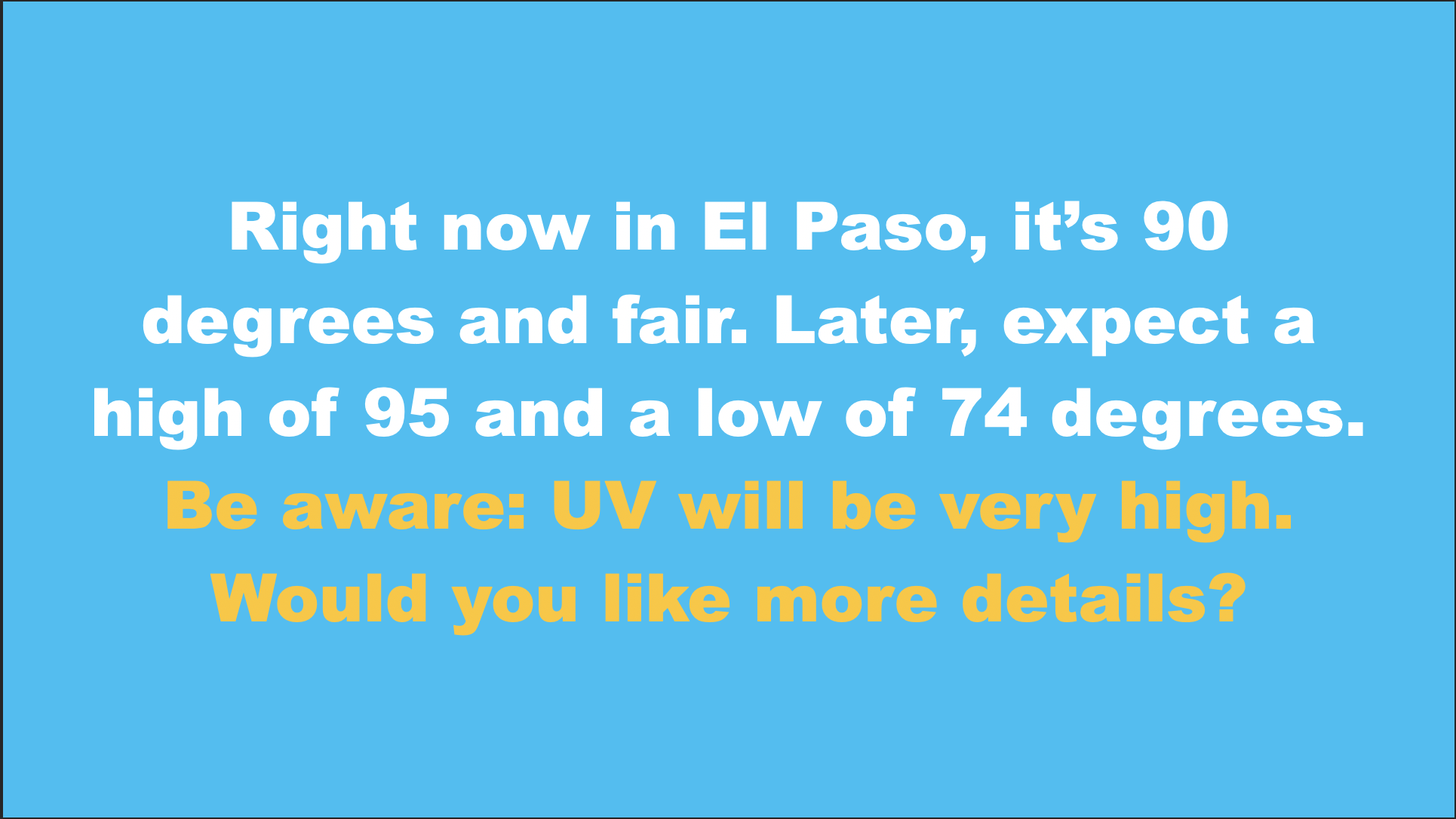
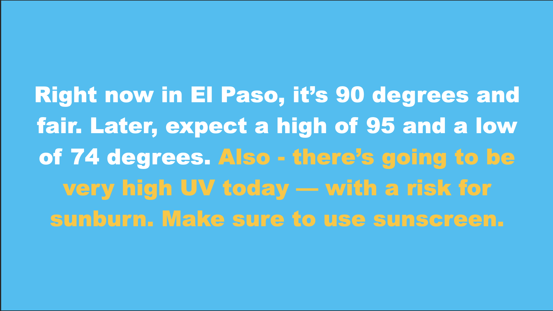
Add a turn 🥇
This idea won on consistency across all of the categories we tested: quality of message, level of detail, length, and wording. It gives the user a choice to know more about the high UV or to move on. While this option won the test, it was only partially implemented. We lost access to resources needed to define the details for high / very UV and all other dominant conditions. So, I cut off the question and made it a single turn conversation.
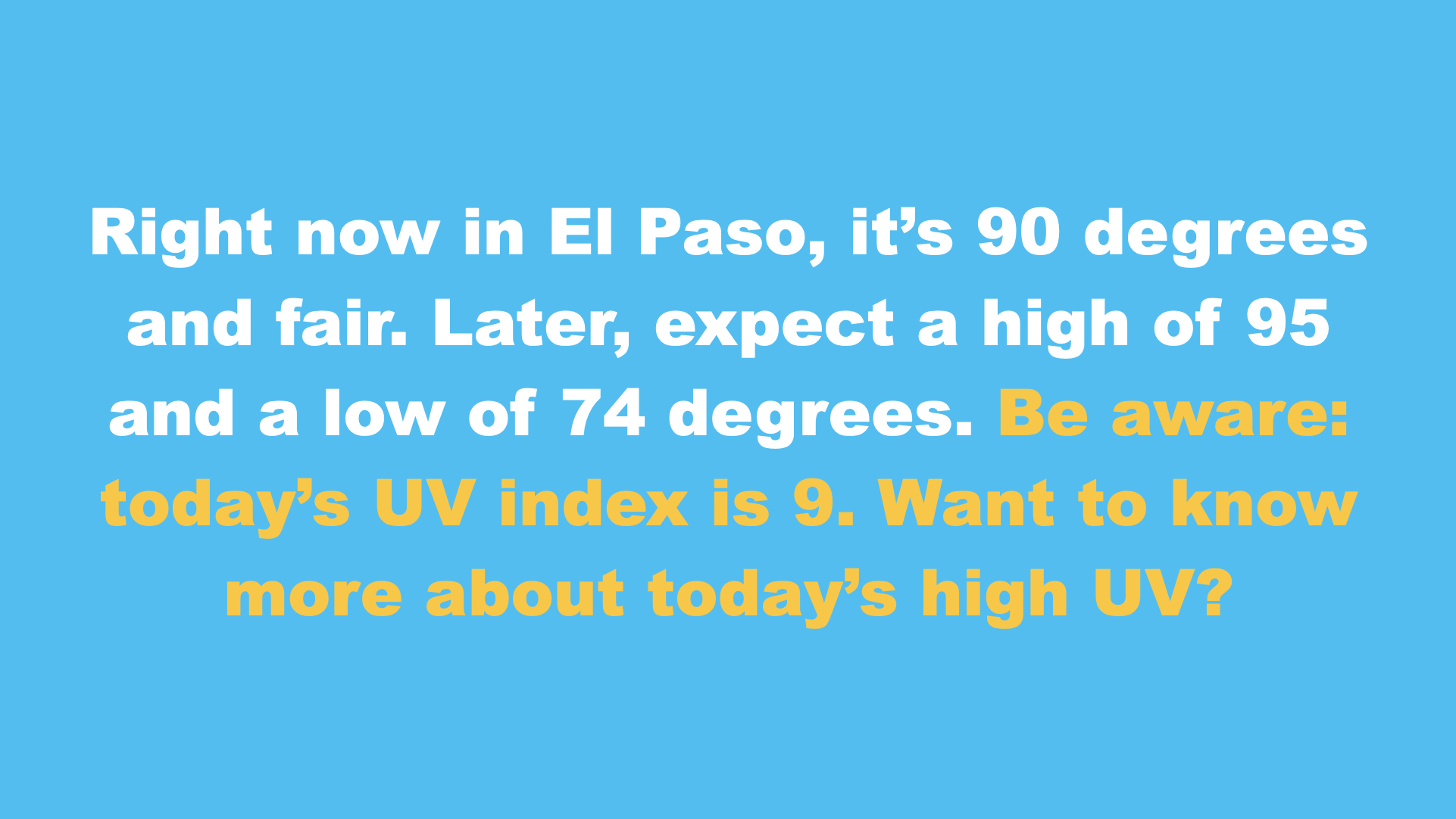
UV Index 🥉
Users had told us that they want data and to make their own decisions. But, here, I encountered an exception. A UV Index value, as it turns out, isn’t all useful. Many users told us they’d heard of it before because it’s used on TV weather forecasts. But, the number itself is neither telling nor compelling. I learned that alerting users to possible danger and telling them that UV was high or very high gave more of cue for users to make plans in these scenarios.